


EC2Y Typeface
Personal Work
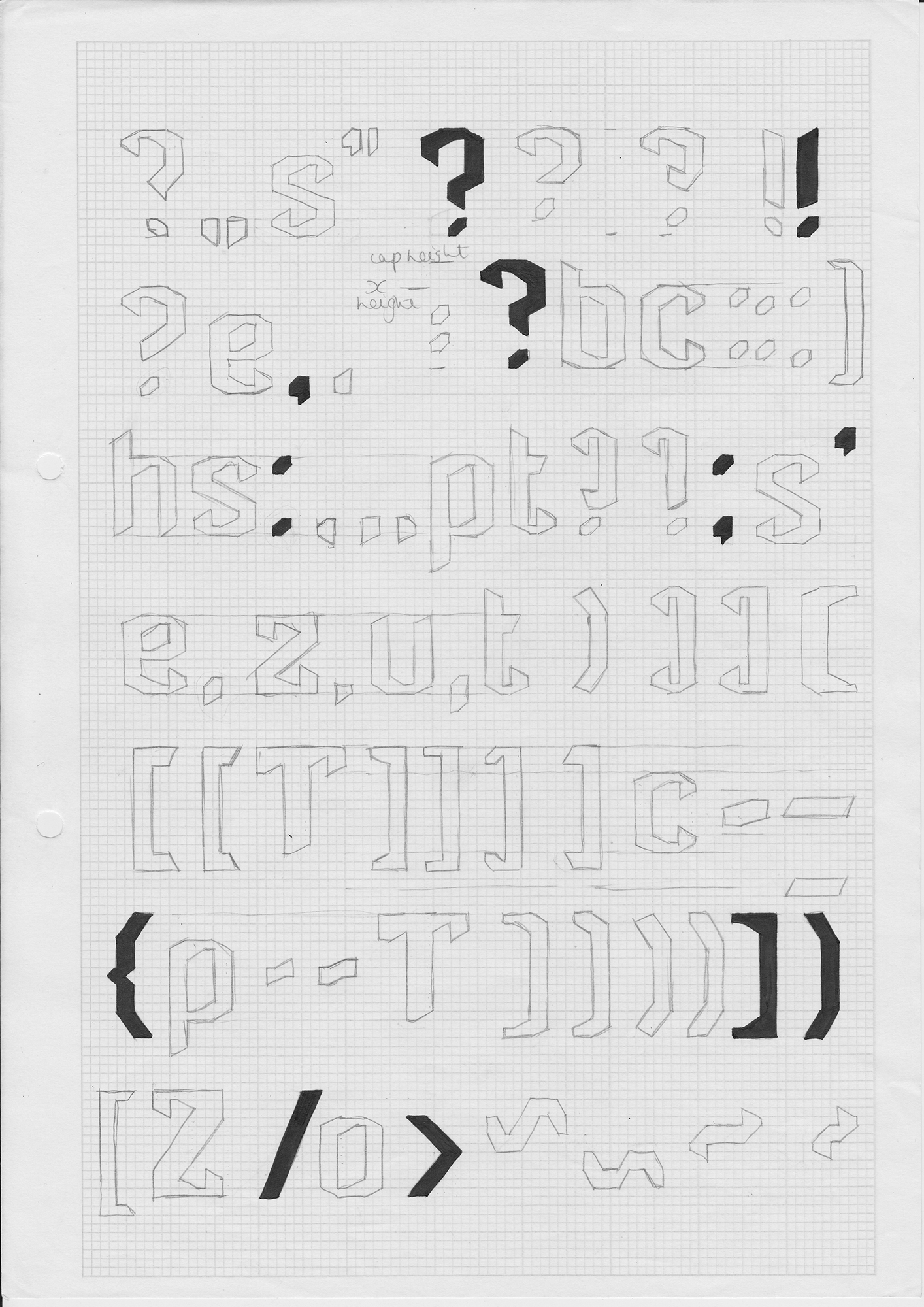
As an architecture geek, I wanted to make a typeface inspired by the grade II-listed Barbican Estate in the City of London, a brutalist concrete development from the ’70s. I tried to capture the strength and uncompromising nature of the estate in the typeface by using the ubrupt shape of the balconies as the basis for the terminals of the letters and recreated the repetiton of the brickwork and structure of the towers in the ‘M’ and ‘N’s. At the end of the project I made the typeface physical again and, with a bit of help from my Dad, constructed a one metre tall concrete letter Z which, after harassing the City of London Council, we reinserted into the main courtyard of the Barbican. I documented the installation and made a type specimen book.